The Colors of Vemados
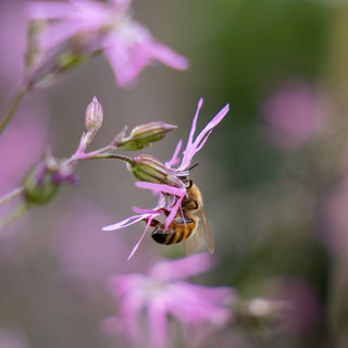
Before a world has a final map, it often has a mood.
For Vemados, that mood has always lived somewhere between old parchment and deep water, tropical flowers and storm-dark skies, sun-washed walls and dangerous histories. It is a world of coastlines, ports, archives, maps, empires, hidden places, and magic old enough to feel almost buried beneath the land itself.
As I’ve been building the visual identity for The Summit Series, I’ve realized that color is one of the clearest ways to understand the world before every detail is explained.
Vemados is not a gray medieval fantasy world.
It is not soft, pastel, or whimsical.
It is also not only dark, stormy, and serious.
It needed a palette that could hold contrast.
Warm ports and dangerous seas. Old maps and tropical markets. Political tension and flowering courtyards. Ancient magic and sunlit coastlines. Beauty and consequence.
That balance became the heart of the palette.
The Inspiration –
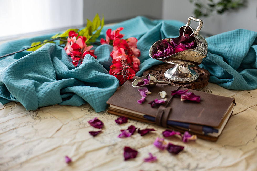
Throughout my search for the right colors, these three, and a combination therein, became the proper starting point. Thank you Pinterest.

The Foundation Colors
The foundation colors are the colors of maps, archives, deep water, old records, and the weight of history.
These are the colors that make the world feel grounded.

Parchment Cream
Parchment Cream is the color of old maps, paper, warm stone, journal pages, and records kept in quiet rooms. It is soft enough to feel welcoming, but it still carries the feeling of cartography and archives.
This color became essential because Vemados is a world built through maps. Before the stories could fully take shape, the world needed coastlines, borders, mountains, rivers, and oceans. Parchment Cream belongs to that beginning.
It is the color of the page before the world is drawn.
Midnight
Midnight is the deepest anchor in the palette.
It belongs to night seas, hidden depths, ancient skies, and the unknown places beneath the surface. It gives the visual identity weight and seriousness. Vemados has beauty, but it also has danger, history, conflict, and old magic.
This is the color that reminds me that not every discovery is safe.
Catalina Blue
Catalina Blue sits between sea and sky, but in its darkest form. It feels formal, maritime, and expansive — a color for deep oceans, political power, navigation, and distance.
It gives the world a sense of scale.
Vemados is not only a collection of beautiful places. It is a world shaped by nations, trade routes, empires, old rivalries, and the consequences of power. Catalina Blue helps carry that larger, more serious atmosphere.
Deep Lagoon
Deep Lagoon is the primary teal of the world.
It belongs to harbors, shaded water, storm-lit seas, old glass, and coastal cities where beauty and danger exist side by side. It is one of the colors that most clearly connects Vemados to maritime fantasy.
It feels alive, but not playful.
Bright, but not childish.
It is the color of water deep enough to hide something.
The Atmosphere Colors
The atmosphere colors are the colors of coastlines, weathered buildings, tropical growth, clay walls, and warm regions shaped by sun and salt air.
These are the colors that make Vemados feel inhabited.
Weathered Coastal Blue
Weathered Coastal Blue feels like faded plaster walls near the sea, salt-worn architecture, pale harbor mornings, and old paint softened by weather.
It brings in the Mediterranean and Caribbean feeling that runs through much of my visual inspiration. It is gentle, but not empty. It carries the sense of a place that has survived heat, rain, wind, and time.
Sun-Washed Green
Sun-Washed Green belongs to foliage, courtyards, herbs, old gardens, and the quieter botanical life of warm regions.
It is not a jewel-toned fantasy green. It feels more lived-in than that. More weathered. More natural. It has the quality of leaves seen through heat and sunlight.
This color helps keep Vemados rooted in the living world.
Emerald
Emerald brings in a brighter pulse of life.
It suggests tropical water, lush greenery, vivid markets, and places where the world feels abundant and full of motion. Used carefully, it keeps the palette from becoming too heavy or too archival.
Vemados needs darkness and depth, but it also needs vitality.
Emerald is one of the colors that gives it breath.
Clay Earth
Clay Earth is one of the warmest colors in the palette.
It belongs to terracotta walls, old pottery, sunbaked streets, port cities, dried earth, tiled roofs, and places where the built world holds the heat of the day.
This color is important because Vemados is not only sea and storm. It is also land, architecture, trade, markets, rooms, courtyards, and human spaces.
Clay Earth makes the world feel touched by hands.
The Energy Colors
The energy colors are the colors of motion, danger, flowers, lanterns, warning signs, and emotional intensity.
These are not the colors I would use everywhere.
They are the colors that appear like sparks.
Sunset Orange
Sunset Orange brings warmth, light, and movement.
It belongs to tropical flowers, lantern glow, painted doors, market stalls, fruit, firelight, and sunset on water. It keeps the visual identity from becoming too cold or purely nautical.
This is the color of arrival.
A port at dusk. A door opening. A flower growing against a weathered wall. A warm light in a dangerous place.
Portland Orange
Portland Orange is sharper and more active.
It has more urgency than Sunset Orange. It works as an accent for moments that need energy: announcements, visual highlights, calls to action, and places where the palette needs a stronger pulse.
If Sunset Orange is lantern light, Portland Orange is the flare.
Pohutukawa
Pohutukawa is the danger color.
It is deep red, but not bright blood-red. It feels older, darker, and more political. It suggests sealing wax, old wounds, warning marks, velvet shadows, bloodlines, conflict, and the cost of power.
This color matters because Vemados is not only beautiful.
There are empires here. There are secrets. There are old histories people would rather keep buried. There are choices that cost something.
Pohutukawa gives the palette its edge.
Coral Pink
Coral Pink softens the warmth without making it sweet.
It belongs to flowers, coral, sun-washed stone, textiles, and the emotional life of the world. It is a human color — less about politics and more about the places where people live, love, wait, argue, and remember.
In a world full of maps and storms, Coral Pink makes room for tenderness.
Why These Colors Matter
Color is not just decoration.
For me, color helps define the emotional logic of a world.
The foundation colors belong to the archive: maps, records, deep seas, night skies, and history.
The atmosphere colors belong to the places themselves: weathered walls, tropical plants, clay streets, harbor mornings, and coastlines shaped by salt and sun.
The energy colors belong to movement and consequence: flowers, lanterns, warnings, blood, markets, firelight, and moments when the world feels suddenly alive.
Together, they create the feeling I want Vemados to carry:
Old, but not dusty. Beautiful, but not safe. Tropical, but not whimsical. Serious, but not lifeless. Expansive, but still intimate. Alive, but shadowed by history.
That balance matters for The Summit Series.
These are stories shaped by storm-swept seas, hidden histories, dangerous magic, political tension, ancient maps, and the fragile loyalties that form when discovery collides with power. The world needed colors that could hold all of that.
A purely dark palette would miss the warmth.
A purely tropical palette would miss the danger.
A purely archival palette would miss the life.
Vemados needed all three.
The Visual Language of Vemados
When I think of Vemados, I think of a map spread across a table, its paper softened by use. I think of dark water beyond a harbor wall. I think of orange flowers against faded blue plaster. I think of clay vessels, old books, green courtyards, storm roads, sunlit markets, and a red mark on a sealed letter.
I think of beauty with consequence.
That is what I want the colors to suggest.
Not the whole world at once.
Just the first glimpse.
A piece of parchment.
A deep sea.
A sunlit wall.
A flash of orange flowers.
A dark red warning.
A blue horizon beyond the map.
That is the color language of Vemados.
And as the visual archive grows — through my website, Pinterest boards, photography, maps, and behind-the-scenes posts — these are the colors I’ll keep returning to.
They are not only part of the brand.
They are part of the world.
To check out some of my Pinterest boards for Vemados and get more of feel for the aesthetic and vibe, find me at https://www.pinterest.com/Jamie_Tudor_Author/

Comments